The challenge
BZ PLUS takes care of gardens, lawns and outdoor spaces. They needed an identity that felt as dependable as their work: friendly enough for homeowners, and sharp enough to hold up on a work shirt, an invoice or a social feed.
The idea
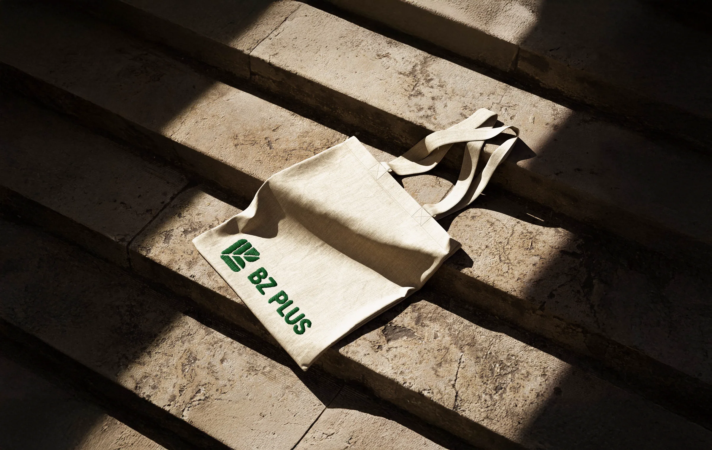
The mark is built from three things: a leaf, a B and a Z. Cut into clean, rounded segments, the veins of the leaf spell out the initials, so the name and the craft live in one symbol.
What I did
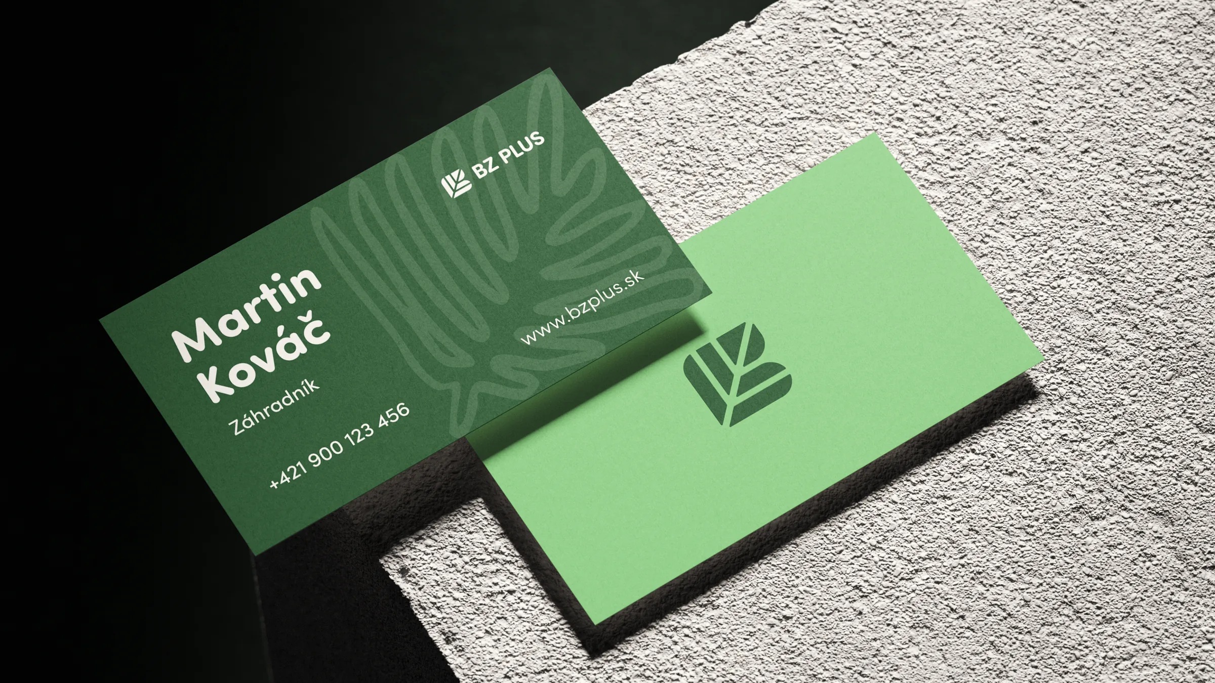
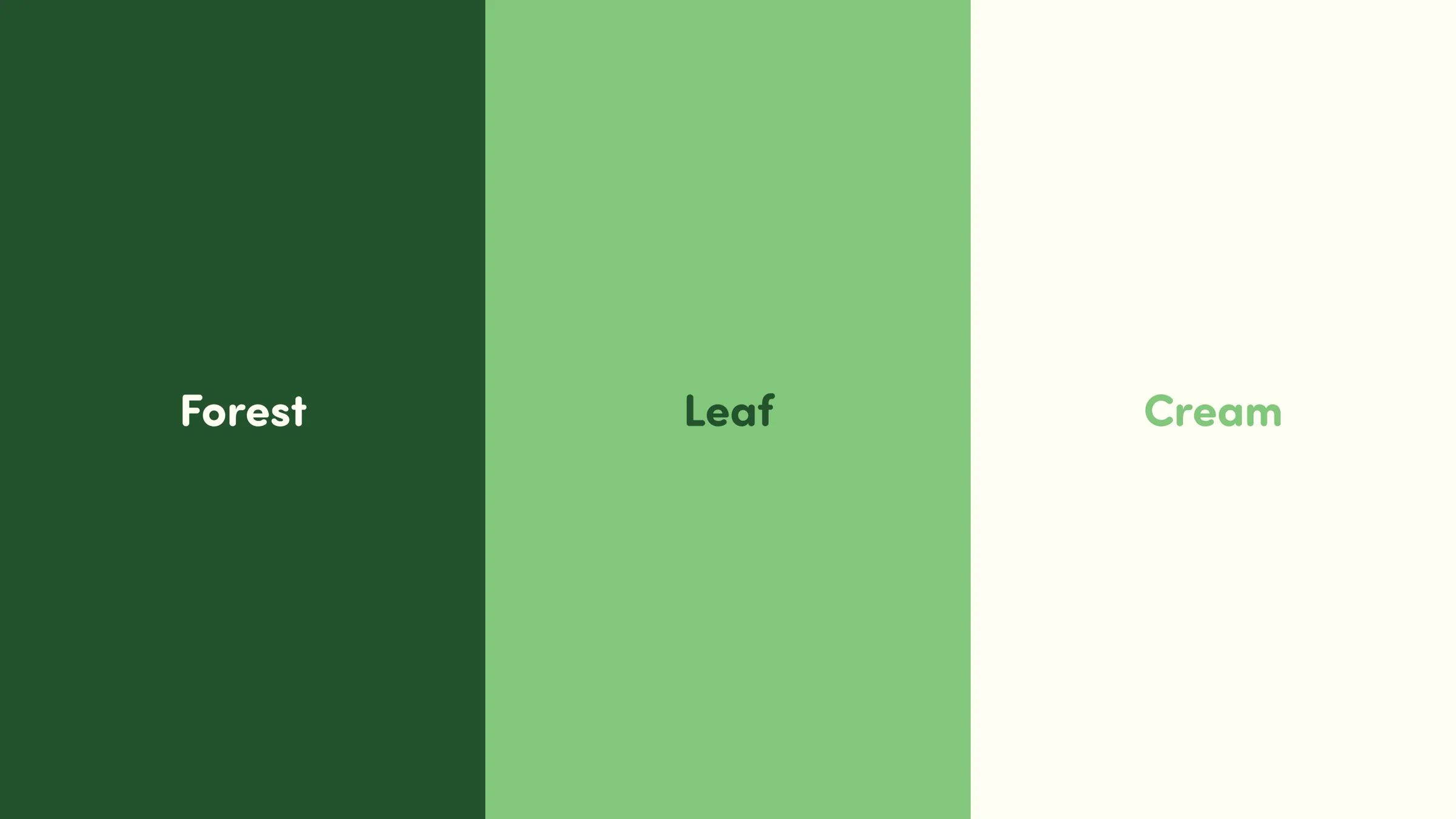
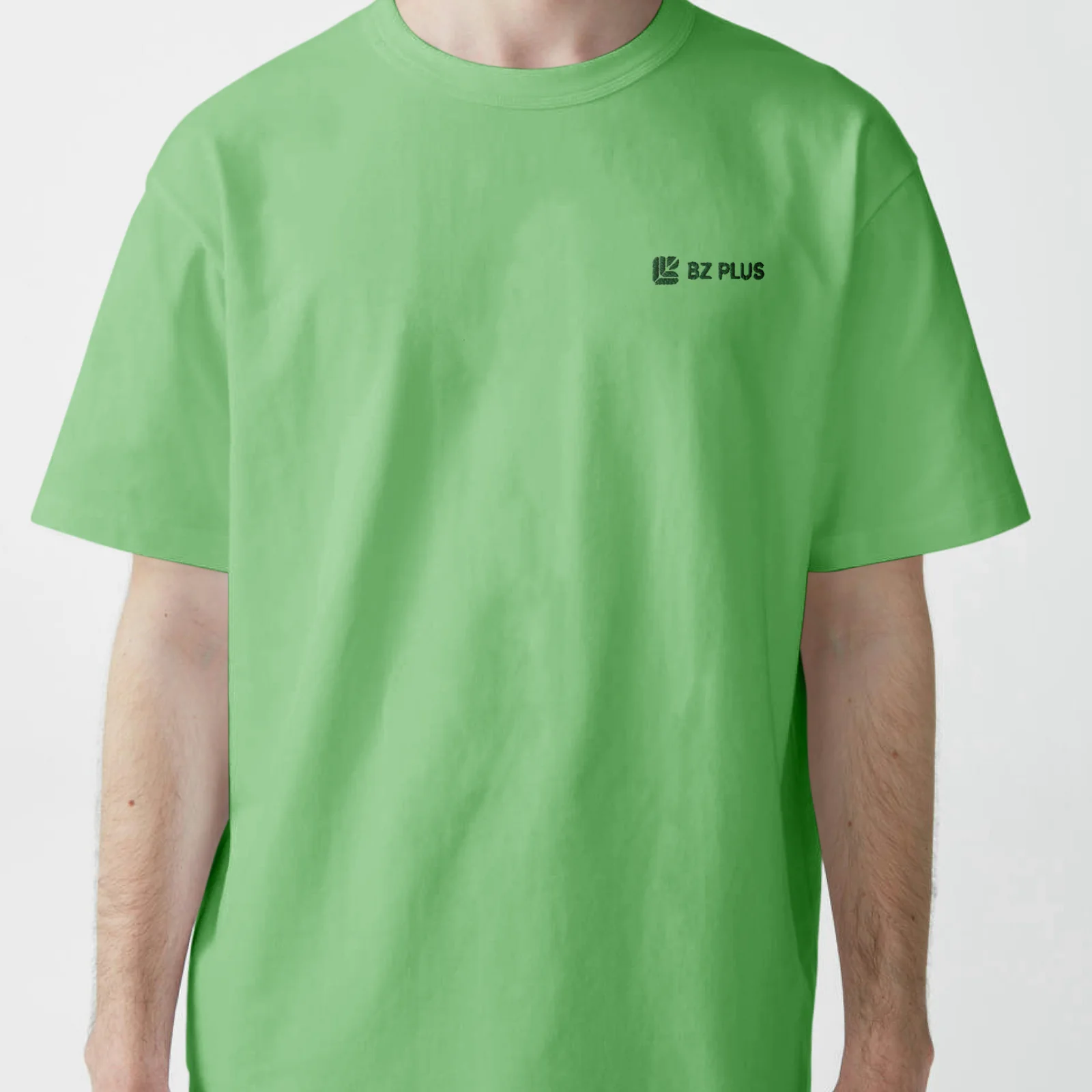
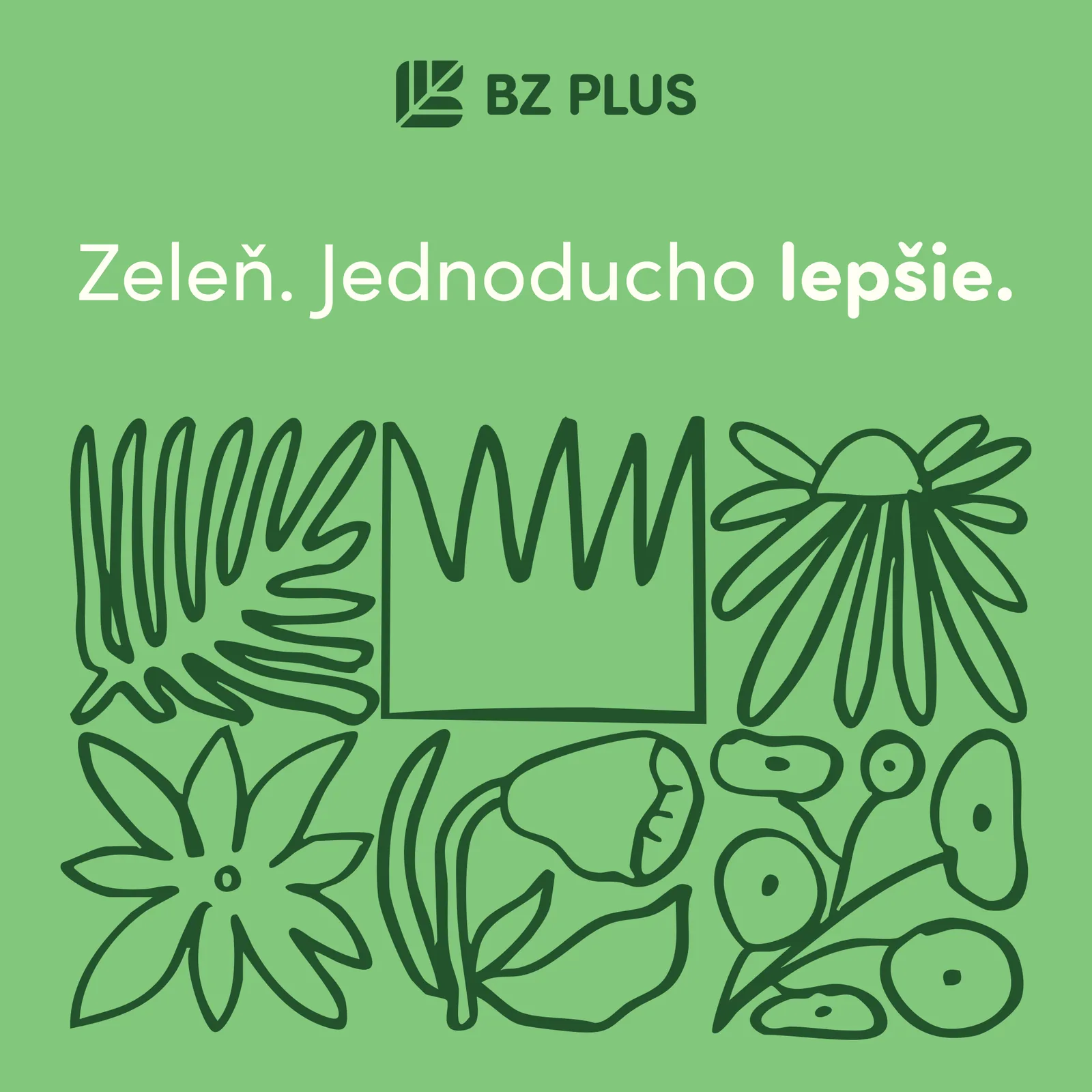
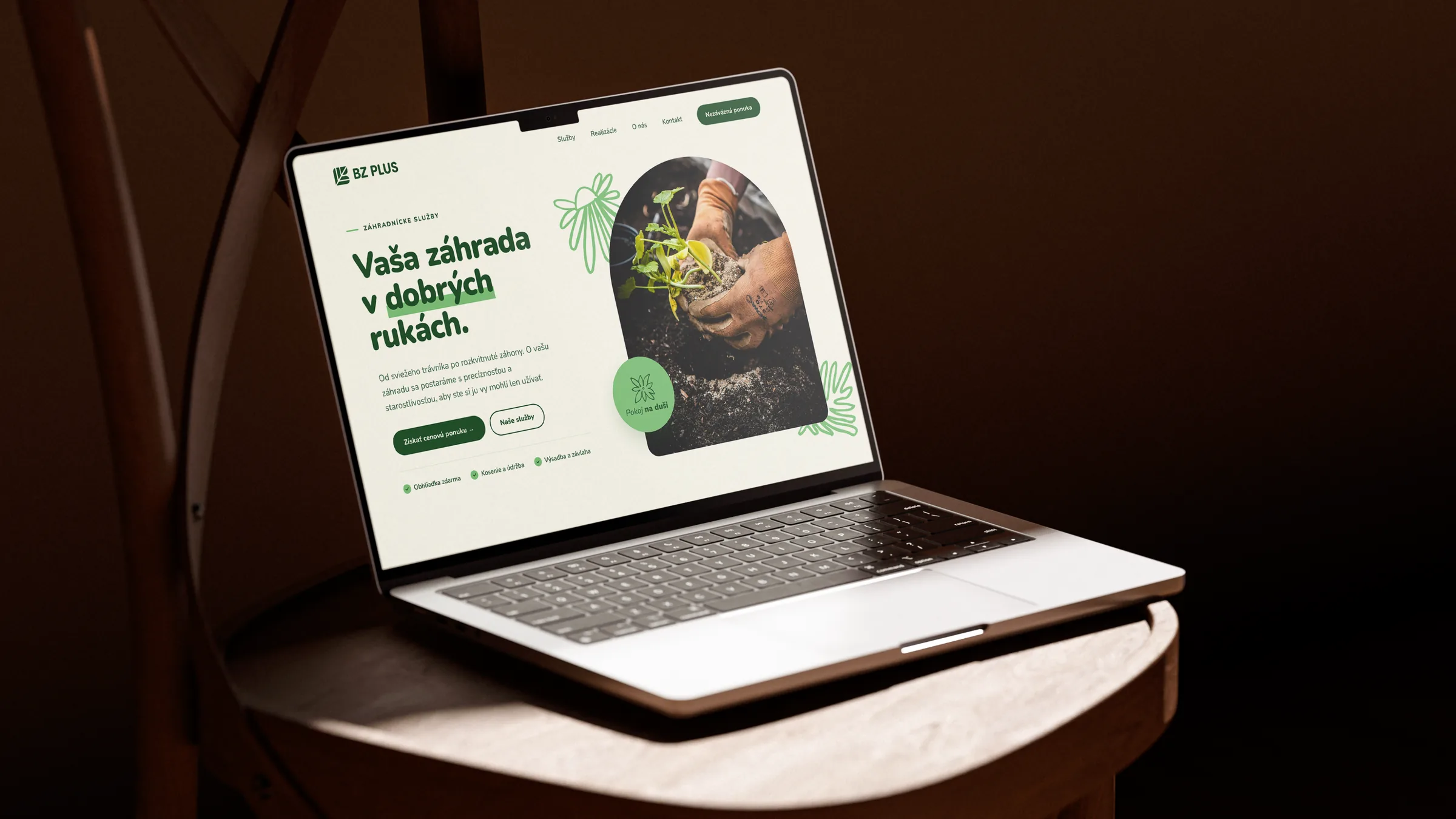
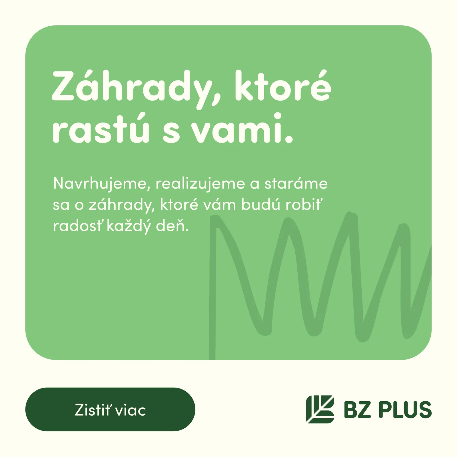
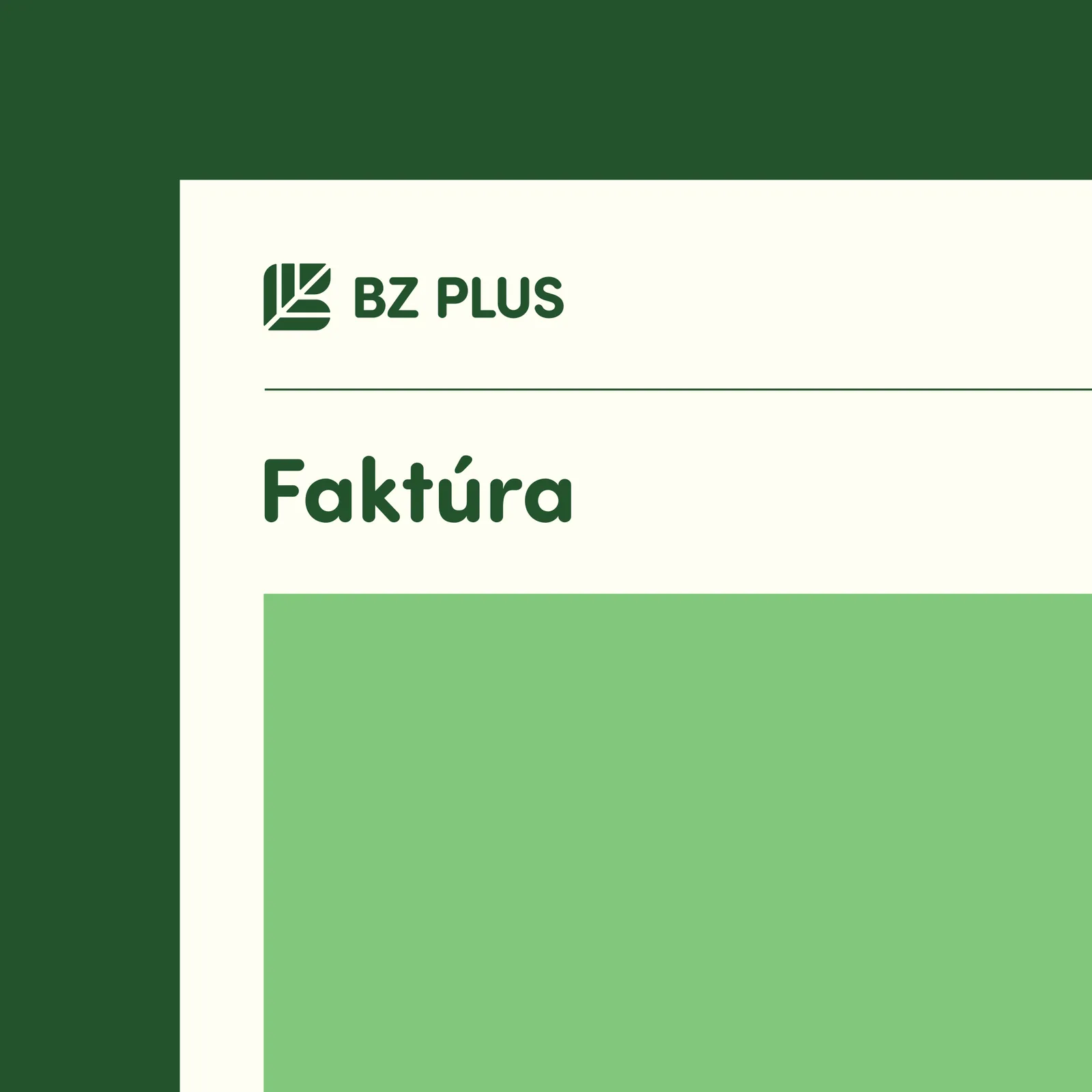
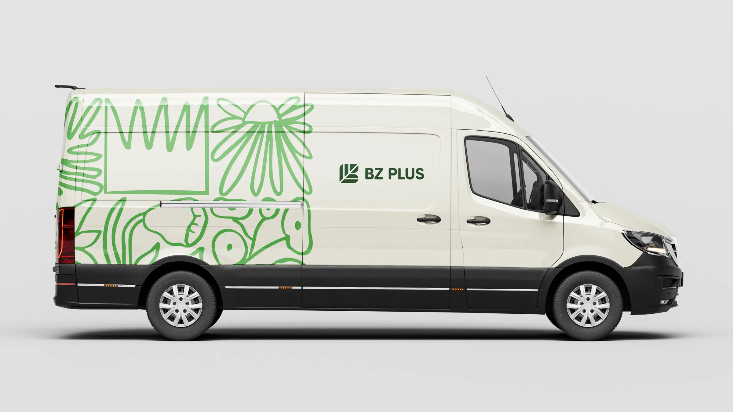
Designed the logo and wordmark, then built the system around it: a forest, leaf and cream palette, Sofia Pro Soft and Sofia Pro typography and a loose plant illustration style. I rolled it out across a van wrap, the website, business cards, invoices, social posts, workwear and tote bags.